
5 min read
Author Bio Page
Humanizing the author page while improving structure and guiding reader actions.
My Role
Product Designer
Team
1 Design Lead
Tools
Figma
Google Analytics
Project Detail
Content XP Rotation
3 weeks (June 2025)
Project Background
Redesigning the author page to strengthen reader to reporter connection and improve usability.
Author pages are key to building trust between readers and reporters. This project focused on improving the overall page experience by clarifying user actions, addressing layout and hierarchy issues, and exploring ways to make the page more useful, intuitive, and engaging for readers.
Did you know author bio pages are 1 of the top 3 searches on site?
Problem
Current author bio pages feel outdated and don't support reader engagement.
Current author bio pages treat authors like corporate bodies rather than real people with perspectives, making it difficult for readers to connect with, trust, as well as engage with the humans behind all of these stories.
In addition:
There’s no clear way to follow authors
Readers aren’t able to easily connect with authors or get a clear sense of who they are
Important key actions like submitting tips are misunderstood
For example: Readers use the “tip” button to complain about print delivery issues
Solution
Making author pages more human, scannable, and actionable.
Created a Follow button to support ongoing engagement
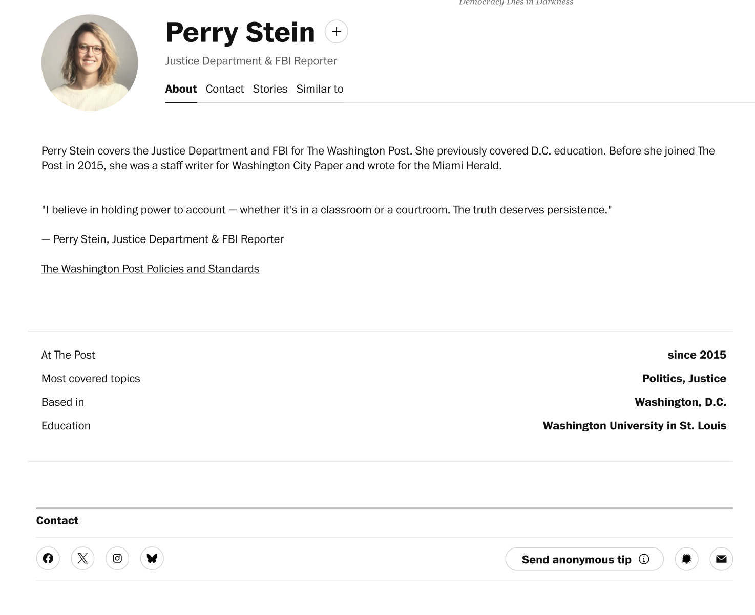
Introduced anchor navigation and tabbed sections for better structure
Created tabs for About, Stories, Contact, Similar to
Enhanced author bios with more personal context, including a journalist quote, to build trust and humanize the page
Accounted for future updates tied to the ‘Author Services’ migration for long-term scalability
Enhancing user experience while aligning with newsroom goals.
Outcome

A few pain points in the current author bio pages
My design improved author pages by making key actions clearer and adding a reusable Follow button. I also made navigation and content easier to use, helping readers connect with journalists better. I worked closely with the newsroom to make sure the design met their needs. I believe that because of this, the project has gained strong support and is now moving forward on the product roadmap for future improvements.
How might we improve the Author Bio Page’s layout and design to make key actions more intuitive and accessible?
Competitor Audit
Conducted an inward and outward audit of direct and indirect competitors to uncover best practices and gaps.
I analyzed both our current author bio pages and those of similar and related competitors. This dual audit helped uncover best practices, highlight gaps in our own design, and reveal opportunities to enhance the user experience and differentiate our author pages.

Some pages of internal audit in progress
Distill
Insights → Product Direction
I analyzed research data to uncover key user pain points, behavior patterns, and goals. These insights shaped clear design considerations that informed product decisions and ensured the solution was aligned with user needs and business objectives.

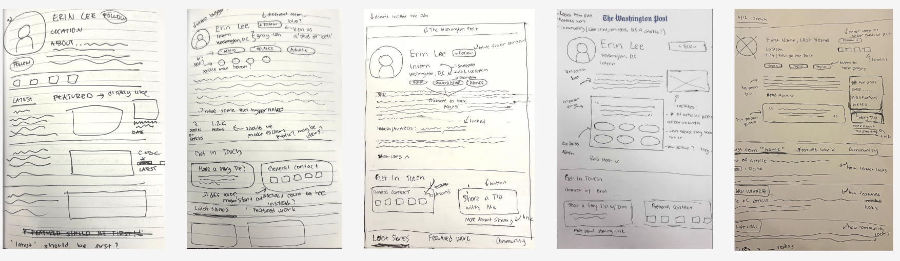
Ideation / Sketches
I began by translating insights from competitor research and into low-fidelity sketches and wireframes, exploring different ways to improve the layout, navigation, and hierarchy of the author page. This stage helped set the foundation for design decisions in later iterations.
Exploring early ideas through sketches and wireframes
I focused on keeping the user experience clear on both mobile and desktop. I worked closely with senior designers and my design lead to create responsive designs that meet editorial goals and keep users engaged.
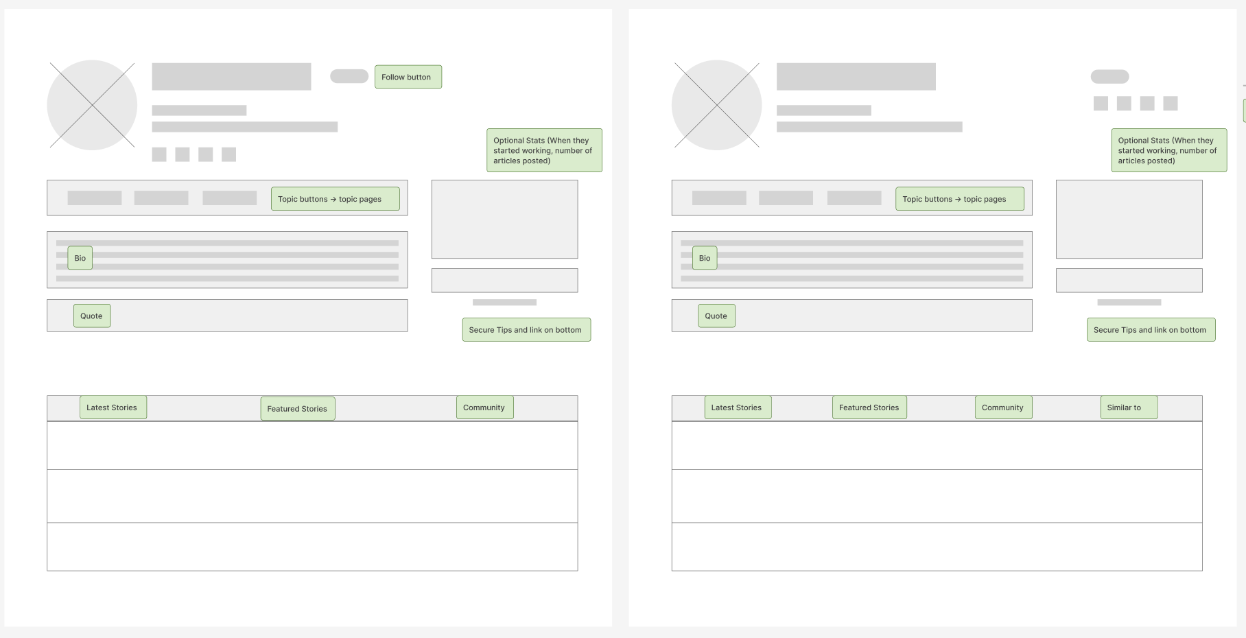
Wireframes
Design Variations (Mobile and Desktop)
I designed and tested variations for both mobile and desktop, focusing on optimizing layout and interaction to meet user needs and editorial goals, while collaborating closely with senior designers and my design lead, Holly.
I was able to recognize the challenges of different screen sizes and explored multiple layout options for the top module without simply stacking elements on mobile. Instead, I focused on how placement and alignment impacted clarity and usability.
Mobile
Explored left-aligned, center-aligned, and other top module placements to find the best fit for readability and flow
Avoided stacking to maintain visual balance and keep key elements accessible without overwhelming the user
Worked closely with senior designers and my design lead, Holly, to review and refine these approaches based on their feedback and expertise
Desktop
Tested inline metadata, persistent anchor navigation, and different layouts for social CTAs and author information
Ensured that sharing and following actions were visible but not intrusive
Maintained a clear visual hierarchy supporting quick scanning and interaction

More recent variations of left-aligned vs center-aligned (Mobile)
First ever variations (Desktop)
Featured Design Screens
Author bio pages designed to boost clarity, engagement, and connection.
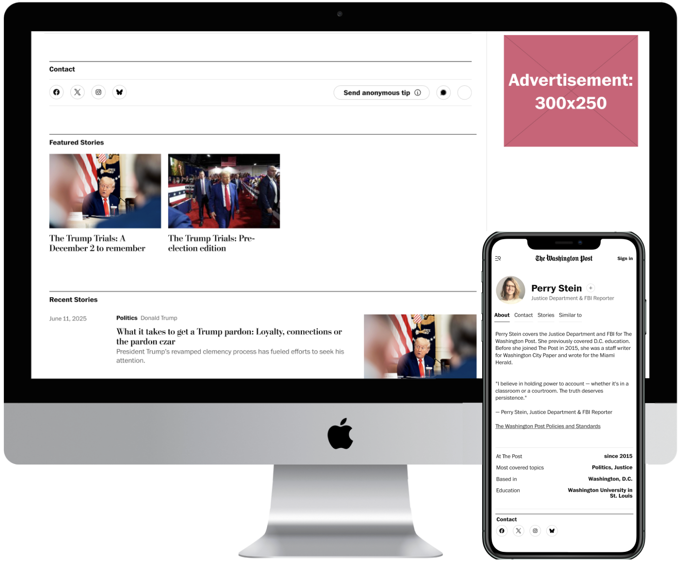
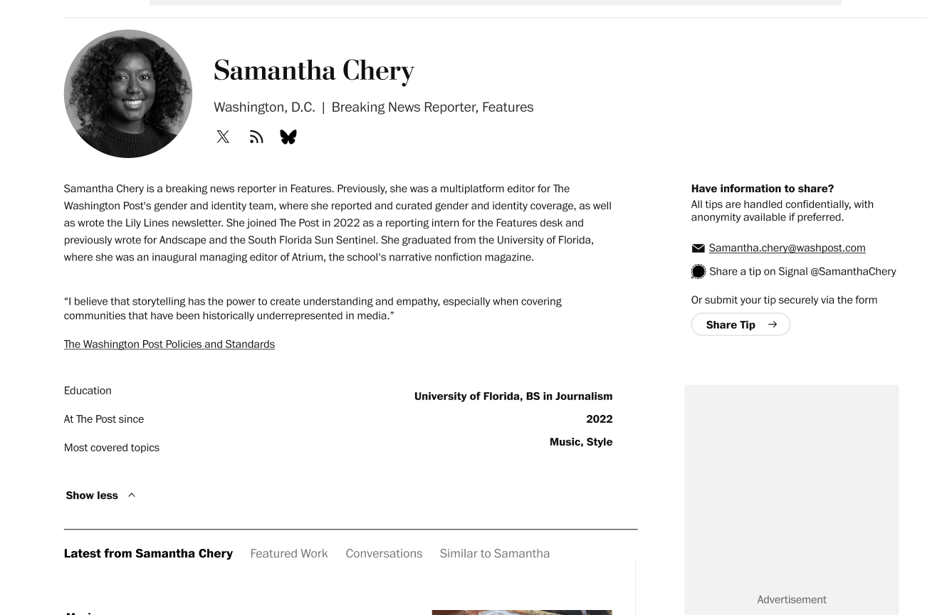
To help readers explore the page more easily, we will add anchor links that allow users to jump directly to key sections: About, Contact Information (socials and tips), Stories (recent and featured), and Similar Authors.
We will add a follow button that is consistent with the topic pages. This allows readers to stay connected with authors they care about.
Anchor Nav + Follow
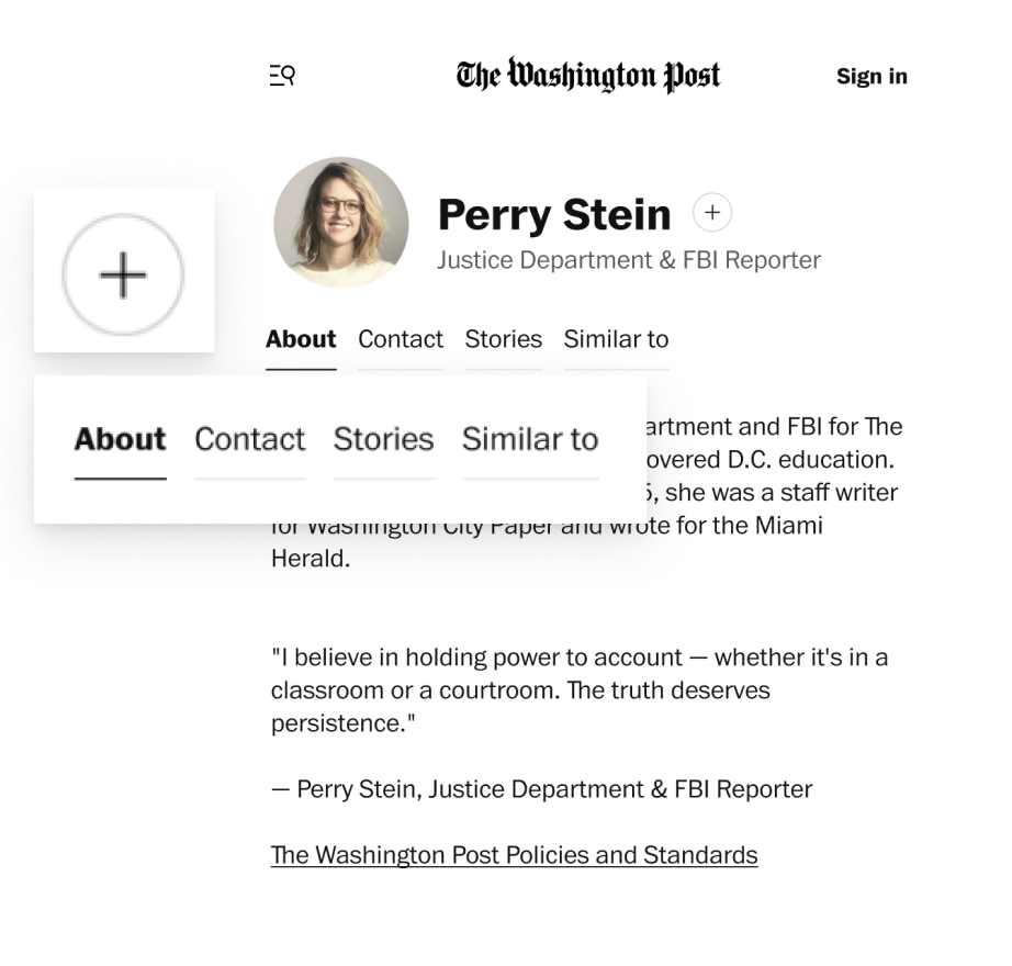
About Tab
The About section includes a quote for readers to get a glimpse into the author’s beliefs, scannable information such as their education, most covered topics, when they started working at The Post (and if they still do).
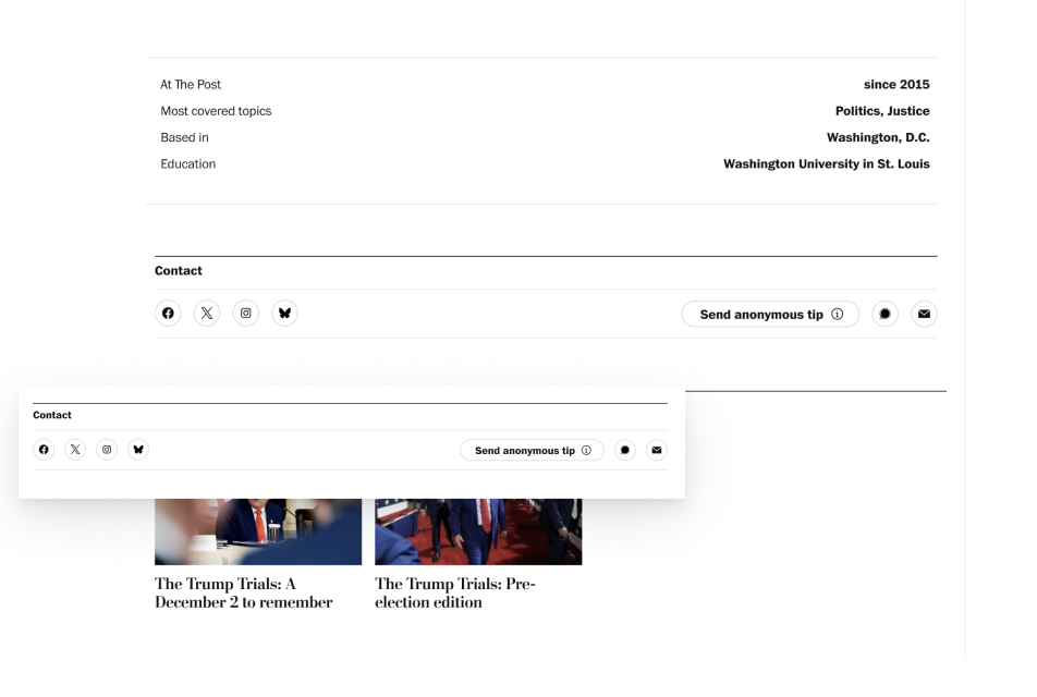
Contact Tab
Contact includes social media icons and a tip button. Signal is also included as a tipping option since many authors have been misusing their title field to share their Signal username.
The “Send anonymous tip” button leads users to our current information page that explains the tipping process. They will also be able to securely submit tips through a privacy focused, anonymous form.
Stories Tab

The Stories section will feature a carousel for pinned/featured articles. These could be award winning pieces or ones the author personally values. Below that there is a section for recent stories, like we currently have.
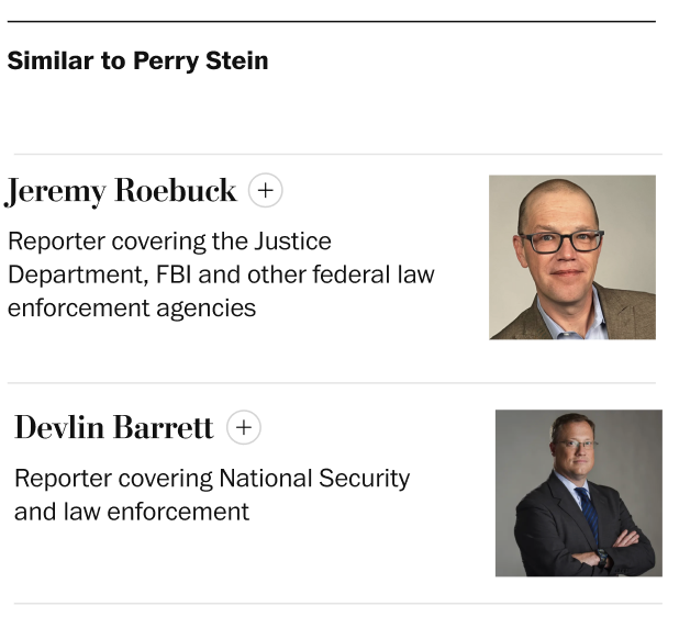
Similar to Tab
This section shows authors who write about similar topics, helping readers discover other voices they might enjoy or learn from.
Project Constraints
Design decisions were shaped by visual guidelines, platform alignment, and scope limitations.
Several constraints influenced the final design decisions. They helped keep my project grounded while still allowing me to make meaningful improvements.
Social links and the tip submission section had to follow existing styles to maintain consistency
The bio and quote needed to use the same font and size as the current design
The overall layout had to align with the new Spectrum topic pages, ensuring visual consistency across products
Ad placements shifted during the project, requiring layout adjustments to accommodate them
Initial ideas like a Community/Conversations tab (for live chats, Q&As, and comments) were dropped to stay within project scope