
8 min read
Bon Bon Bon
Redesigning an artisan chocolate e-commerce site to reduce visual overwhelm and improve product discovery for gift seeking customers.

My Role
Leader, UX Designer, UX Researcher
Tools
Figma
UserTesting
Miro
Project Detail
Solo Course Project
6 weeks
Project Background
Bon Bon Bon's website makes gift shopping harder than it should be. Competing visuals, confusing navigation, and hidden features get in the way of the brand's fun personality.
Bon Bon Bon is a Detroit chocolate shop known for seasonal bonbons and playful packaging. Their website needed a redesign to help gift buyers discover and purchase products more easily.
Did you know 68% of chocolate purchases are gifts, making product discovery essential for driving sales in the artisan chocolate market?
(National Confectioners Association, 2023)
Problem
Gift shoppers struggle with three main issues:
⚠️ Too much visual clutter
Auto rotating banners, competing buttons, and distracting animations create cognitive friction. Users can't focus on what matters: the chocolates.
📱 Broken mobile experience
The desktop layout doesn't translate to mobile. Misaligned buttons, poor spacing, and a lack of visual hierarchy make browsing frustrating on smaller screens.
🔍 No product discovery
The desktop layout doesn't translate to mobile. Misaligned buttons, poor spacing, and a lack of visual hierarchy make browsing frustrating on smaller screens.
How might we make gift shopping easier and introduce product discovery while maintaining Bon Bon Bon’s playful brand personality?
Solution
Building intuition into every interaction.
I redesigned the site to reduce visual clutter, improve mobile usability, and introduce product discovery features. My solution makes it easier for customers to find complementary items and complete their purchase with confidence.
Introduced a "Complete Your Gift" add ons section that doesn't exist on the current site. Customers can now see which products go well together and build gift sets easily.
Cleaned up the homepage by removing auto-rotating banners, making buttons clear, and adding more white space so people can focus on the chocolates.
Fixed mobile with bigger buttons, better spacing, and navigation that works on small screens.
Made "Add to Cart" buttons always visible so people don't get confused by hover effects.
Added clear payment options at checkout with Apple Pay, Google Pay, and Visa logos instead of vague labels.
Research → Define → Ideate → Design → Test
Project Process
Heuristic evaluation
Competitive analysis
User Persona
Product Vision Board
Design priorities
Crazy 8 sketches
Wireframes
"Complete Your Gift" concept
Design system
Lo-fi/Hi-fi screens
Clickable prototype
3 usability tests
Design iterations
Final designs
Heuristic Evaluation
I tested the current site on desktop and mobile, following the path from homepage to checkout.
Navigation Problems:
Buttons are misaligned on mobile
Same navigation on desktop and mobile (not responsive)
CTA buttons with no clear priority
Visual Overload:
Rotating banner messages users can't read in time
Too many elements competing for attention
Distracting background images
Missed Opportunities:
No way to help customers discover complementary products
Homepage examples showing visual clutter and competing CTAs
Competitor Analysis
I looked at two other Ann Arbor chocolate shops to see how Bon Bon Bon compared…
🏆 Mindo Chocolate Makers
Premium positioning with awards
Educational focus with classes and tours
🏠 Sweet Gems Confections:
Traditional, heritage brand (since 1997)
Focuses on personal story and local ingredients
Bon Bon Bon's Opportunity
Fill the gap between traditional and premium with a modern, gift focused experience that's both fun and easy to use while adding product discovery features that competitors lack.
User Personas
Understanding Users
Meet Maya!
Maya is a 29 year old marketing coordinator who loves finding unique gifts for friends and family.
Maya’s needs:
Quick shopping on mobile
Clear product info
Easy to read reviews
Maya’s frustrations:
Hard to navigate mobile sites
Overwhelming product pages
Hidden reviews
Maya represents the gift buying customer Bon Bon Bon wants to reach: busy individuals who need a smooth, trustworthy shopping experience.

Product Vision
I mapped out user needs and business goals to guide my design decisions.
Target Users: Gift shoppers aged 25-40 in metro Detroit
Main Goal: Make navigation clearer and introduce product discovery features to turn first time shoppers into repeat customers while increasing average order value.
My Product Vision Board defines a clear path to address usability issues while preserving Bon Bon Bon's playful brand personality.
This strategy prioritizes streamlined navigation and enhanced product discovery to convert giftseeking professionals into loyal customers.

Design Process
From Research → Design
My research showed three key priorities:
1. Simplify the layout
Reduce competing elements
Make primary buttons obvious
Add more white space
2. Create product discovery features
Design a new add ons system
Help users see what goes together
Make adding items easier
3. Fix mobile experience
Optimize for touch screens
Fix button sizes and alignment
Ideation
Crazy 8 Sketches → Solution Sketch
Exploring early ideas through sketches…
I explored different ways to introduce product recommendations on the product detail page. After discussing with classmates, I decided to move forward with the "Complete Your Gift" concept: visual bundling that shows customers how products pair together.

Crazy 8 Sketches with recommendations within whole site

Final solution sketch showing bundling concept
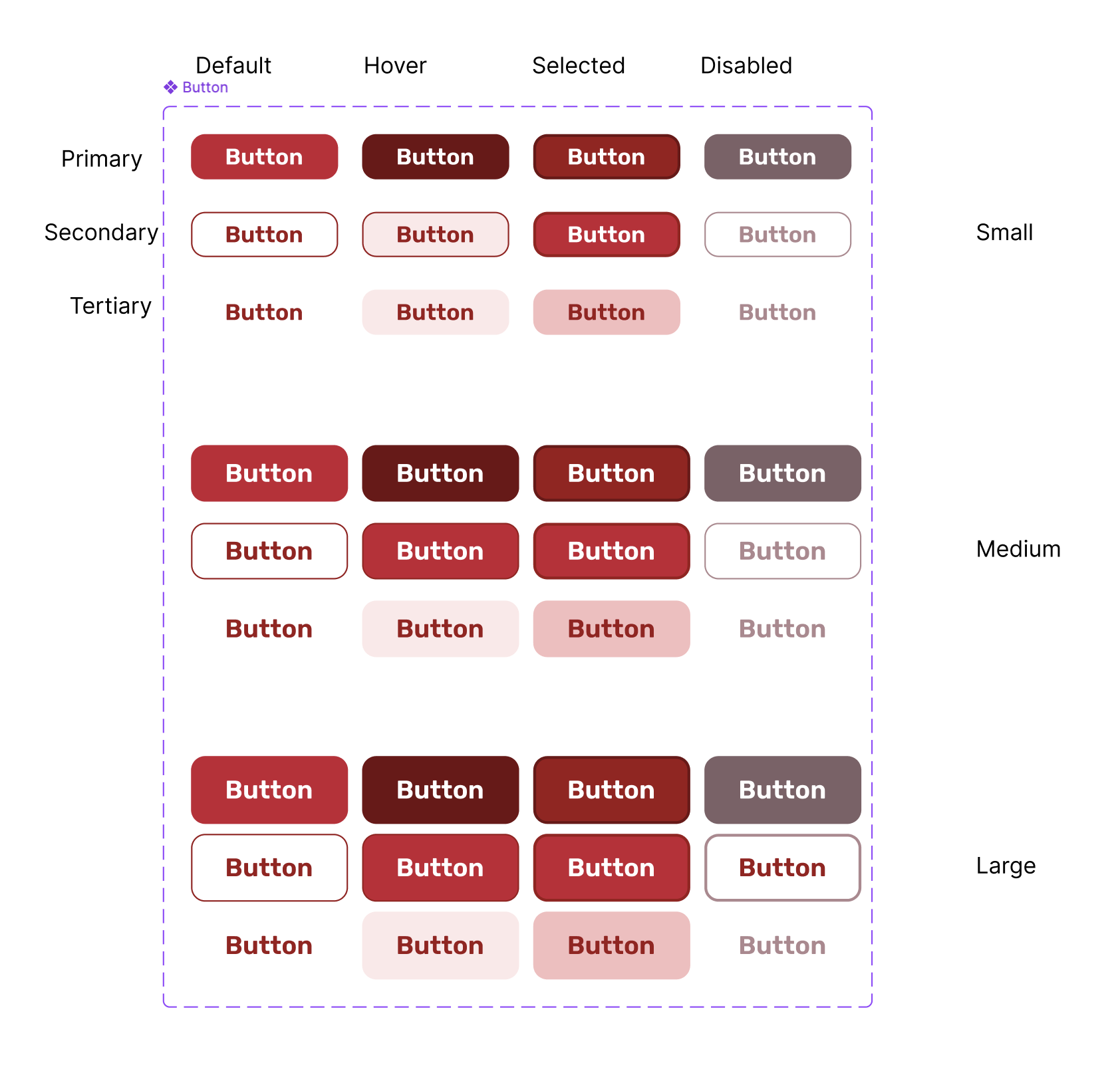
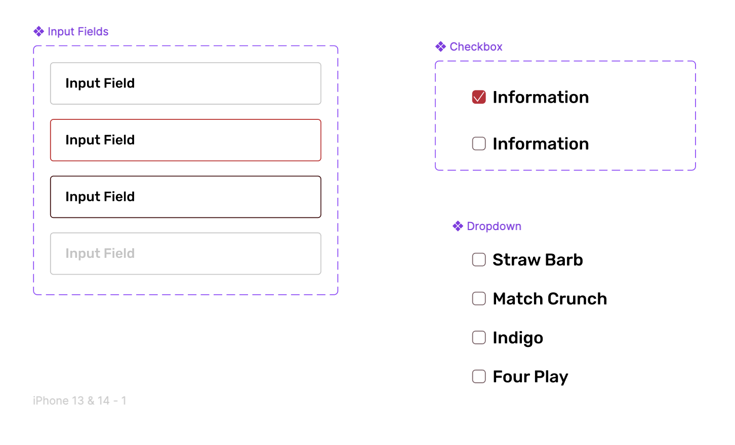
Design System
Building consistency and efficiency into the redesign.
Before designing screens, I established a design system based on Bon Bon Bon's existing brand identity to ensure visual consistency and accessibility across all pages.
Brand Foundation
I pulled the primary colors and playful typography from the original website to stay true to Bon Bon Bon's brand personality. All color combinations were tested to meet WCAG color contrast standards.
Components
I created reusable buttons, product cards, form fields, and navigation elements to streamline my design process and maintain consistency. Using components allowed me to iterate quickly and update designs across all screens.


Peer Critique
Peer feedback + iterations


User Testing
Testing with real users
I tested my initial prototype with real users to see if my redesign made shopping easier.
Method:
I presented users with my prototype first, then had them complete the same task on the live Bon Bon Bon site for comparison. This allowed me to see which version was more intuitive and where users struggled.
What I was testing for:
Could users find the add ons section?
Was the checkout process clear and easy to follow?
Did the visual hierarchy help or hinder browsing?
How did my prototype compare to the current site?

Affinity Diagramming
After user testing, I compiled all feedback into categories to understand what changes I needed to make.

What I learned…
Users loved the clean layout and friendly feel as it was easier to scan than the current site! All 3 users agreed the add on concept worked but they couldn't find the add ons section because it was at the bottom of the page.
User ratings: 8/10, 9/10, 5/10 (average 7.3/10)
“This is exactly what I want! So much easier than the real site." — Participant 2
"The prototype felt simple, intuitive, and easy to navigate." — Participant 1
"I had a better understanding of what I was purchasing. The add-ons section was really clear once I found it." — Participant 3

How users described the experience…
Users consistently described my prototype as simple, intuitive, and easy. However, the add ons placement issue was unanimous as most participants wanted it moved higher on the page.
"Because the cassette is down here too, it's just a weird placement. I wish that this was smaller, shrunken and like right here. That's the only thing that I dislike." — Participant 2
"I thought that whatever was at the bottom was like a recommendation section... I didn't know it was something I could add on." — Participant 1
Design Interations
Based on testing feedback, I made 3 key changes.
Moved add ons up
Placed "Complete Your Gift" right below the main product with individual "ADD" buttons on each item.
Fixed buttons
Removed hover confusion, made all buttons say "ADD TO CART," and increased size to 44px for accessibility.
Better checkout
Replaced vague "EXPRESS CHECKOUT" with Apple Pay, Google Pay, and Visa logos.

↓


↓


↓

Annotations
Annotating for the dev team
After completing my designs, I included detailed annotations to support a smooth handoff to the future development team. I also incorporated error messages and alternative text to enhance accessibility.

Final Designs
A cleaner, more intuitive shopping experience that helps customers build the perfect gift.
Before and after examples of: Homepage, Product Details

After testing and iterating, I created a responsive design that simplifies navigation, introduces cross selling, and maintains Bon Bon Bon's playful personality.
Full User Flow


Homepage → Product Listing Page → Product Details Page → Cart Page → Checkout Page → Order Confirmation Page

Experience the full flow from browsing to checkout.
Outcome
Introduced cross selling functionality and improved mobile experience.
My design introduced an add ons feature that doesn't exist on the current site, making it easy for customers to build gift sets. By creating the "Complete Your Gift" section, I added a revenue generating feature while solving product discovery issues. I also improved navigation with consistent button labels and larger touch targets. User testing showed the prototype felt "friendlier" and "less overwhelming" than the current site, with participants rating it 8/10, 9/10, and 5/10 (average 7.3/10). My redesign maintains Bon Bon Bon's playful brand while introducing new functionality that supports both users and business goals.
Reflection
Impact
I introduced an add ons feature that doesn't exist on the current site, making gift building easier for customers while creating new revenue opportunities. User testing showed the prototype felt friendlier and less overwhelming, with an average rating of 7.3/10.
What I Learned
Testing early caught critical issues. 100% of users couldn't find the add ons at first. Listening to user frustration and iterating quickly led to the best solution.
"Work is never done, it's just due."
Next Steps
Test the updated add ons placement with new users
Track conversion rates to measure business impact
Design the seasonal collection browsing experience
Add personalization based on browsing history