
5 min read
Safe Walk
A native iOS app that helps students feel confident and supported on every walk home.

My Role
UX Designer, UX Researcher
Tools
Figma
Apple’s iOS Library
Project Detail
Group Course Project
5 weeks
Project Background
SafeWalk is a native iOS app designed to address campus safety concerns for college students walking alone at night.
Problem
Students feel unsafe walking alone but won't call 911 because it feels too extreme.
Existing safety apps have significant gaps:
Emergency features are buried in cluttered interfaces
No direct connection to campus police.
Real time communication with trusted contacts during unsafe situations is limited.
How might we help college students feel confident and supported when walking alone at night?
Solution
Making safety simple and accessible.
We designed SafeWalk to prioritize speed and build trust.
The app gets students help fast and keeps them connected with people they trust.
1-Tap Emergency SOS that doesn't exist on competitor apps. Students get help in 8 seconds without complicated interface.
Direct campus police integration sends officers exact location and student info instantly, eliminating phone call delays and building trust.
Live location sharing with bigger map interface and clear status indicators so friends can follow your walk in real time.
Clear visual hierarchy using blue (safe), yellow (alert), and red (emergency) so students instantly understand their status and available actions.
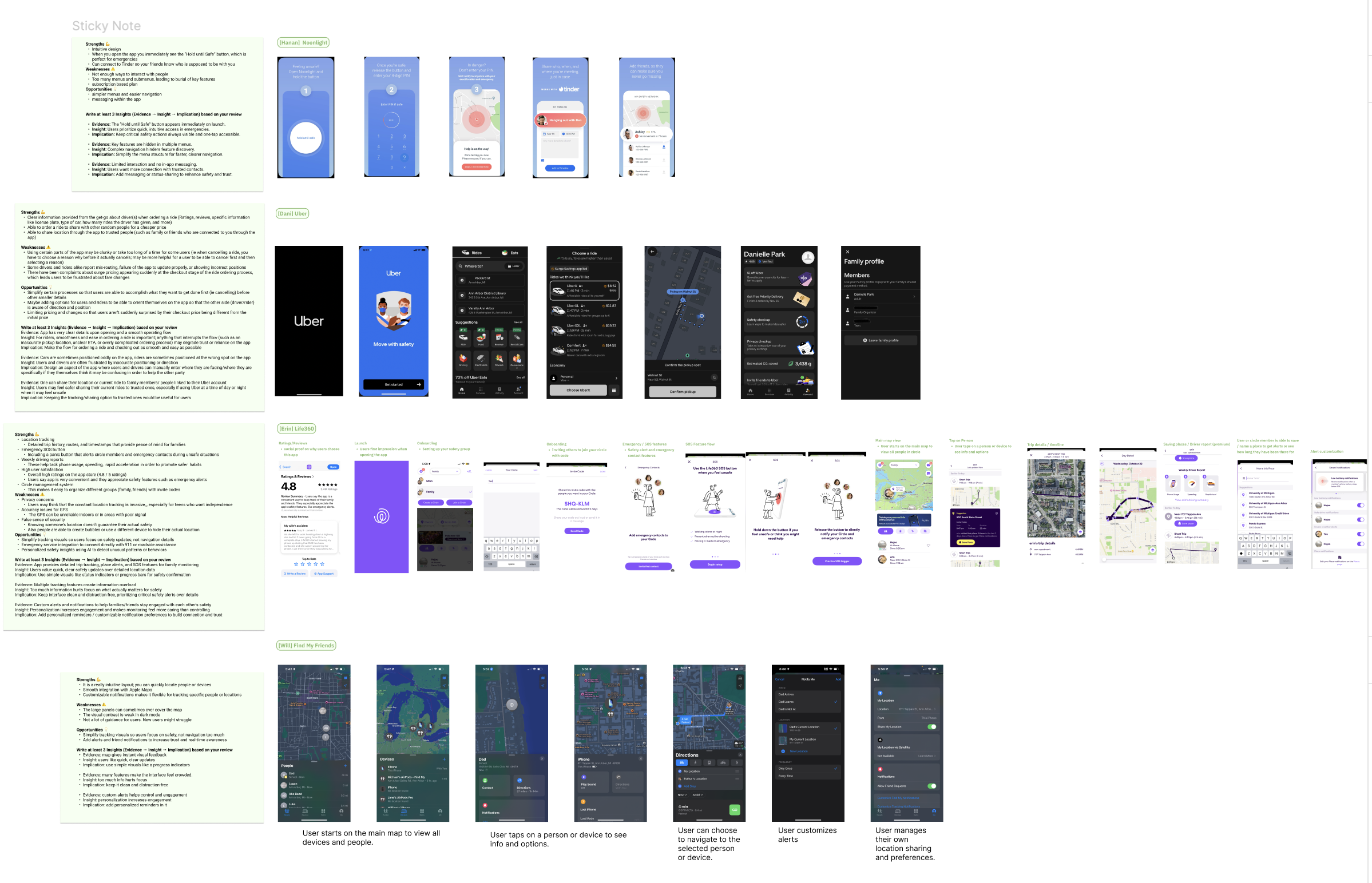
Research and Discovery
We tested 4 competitor apps to understand what wasn't working.
Hard to Find Help
Emergency features buried in menus (Noonlight). Students waste precious seconds searching during urgent situations.
No Campus Connection
No apps connect directly to campus police. Students forced to choose between 911 (too extreme) or nothing.
Cluttered Interface
Too many features competing for attention (Life360). Students can't quickly identify what they need.
Limited Real Time Support
Can't stay connected with friends during the walk (Uber, FindMyFriends). Once you share location, communication ends.
Analyzed 4 indirect and direct competitors including Uber, FindMyFriends, Life360, Noonlight.
Product Vision Board and Insights
Defining our strategy based on what our users actually need.
After conducting user research and competitive analysis, we compiled our findings.
We found that the main pain point students faced was that existing safety apps had emergency features buried in cluttered interfaces, making them unusable in urgent situations. We also found that students needed direct campus police integration and real time connection with trusted friends to feel truly supported during their walk home.
User Personas
Understanding Users
Meet Juniper, our target user!
Juniper is student who feels nervous walking alone at night but is hesitant to call 911 because it feels so extreme. We realized students need a quick and simple way to get help.


Ideation and Sketching

Exploring different approaches through rapid sketching.
Our team conducted "Crazy 8s" exercises..
My focus: Emergency SOS flow
I explored multiple ways students could activate emergency help:
Should it be tap, hold, or swipe?
Where should the button live on screen?
How do we prevent accidental activation while keeping it fast?

Wireframes
Translating sketches into complete user flows!
What did we accomplish?
I created wireframes mapping out the entire emergency activation journey:
Emergency SOS Flow:
Student activates SOS (hold for 5 seconds)
Confirmation screen shows officer details (name, ETA, location)
Option to add emergency contacts or record surroundings
Notifications sent to campus police and emergency contacts
"I'm Safe Now" button to end the emergency
Key screens designed:
Emergency SOS activation with hold timer
Officer details confirmation
Emergency contacts management
Secure recording feature
Messages integration for friend communication


Usability Testing


Testing with students to validate our design.
We tested 2 core tasks with 5 students who weren't on our team in order to avoid bias.
Task 1: Respond to a safety emergency using SOS
Task 2: Check a friend's location and customize settings
Key insights from testing:
Students struggled to find the SOS button in the bottom navigation and weren't sure what would happen after activating it. The navigation icons were unclear, and some users misunderstood the app's overall purpose. However, once users found the SOS screen, the emergency flow worked well.
Changes we made based on feedback:
We added an exclamation point icon to the SOS button in the navigation bar for better visibility. We also added a "Cancel" button during SOS activation so users feel in control and can undo accidental activations. Bottom navigation received clearer icons and labels, we made "Start a Trip" copy more intuitive, and added page indicators to show users where they are in the flow.

We tested different methods such as Mr. Tappy and OBS but ultimately decided on iPhone screen recordings with audio and zoom calls.

Final Screens and Prototype
Reflection and Next Steps
We created a final prototype using Figma and Apple's iOS design library. Our design features clear visual hierarchy, accessible color contrast ratios, and native iOS interactions that make the app intuitive for iPhone users.
Polished screens incorporating all feedback and testing insights.
After multiple rounds of iteration and usability testing, we created our final prototype using Figma and Apple's iOS design library. The final design features clear visual hierarchy, accessible color contrast ratios, and native iOS interactions that make the app feel intuitive and familiar to iPhone users.

Future Improvements
Non emergency features such as campus updates, suspicious activity alerts, and check in reminders for everyday safety
Better personalization including customizable alerts, vibration patterns
Enhanced accessibility for improved contrast, motion settings, and voice based triggers

I ended up making a few changes in my mid-fidelity sketch based on feedback from the Crazy 8s.
My group members, specifically Hanan, liked the versions that used elements from Noonlight which was one of the apps we looked at during our competitive analysis!
I also added features like the alarm sound option / or even possible a video recording option as well as multiple CTAs because my teammate, Will liked this. Lastly, I included a notification pop up to make it clear when help is on the way.
My key insight from sketches:
The SOS button needed to be prominent and centered on the screen, but required intentional activation (holding for 5 seconds) to avoid false alarms.
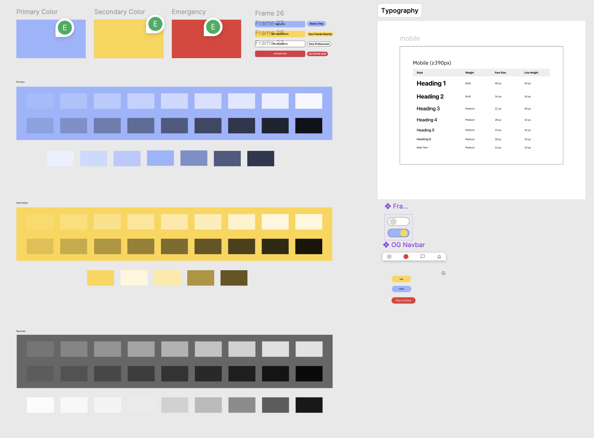
Design System
Built with Apple's iOS standards for instant familiarity.
We used Apple's iOS library and Human Interface Guidelines as our foundation.
By doing this, we knew that most users would already know how to use our app and there would be no learning curve, especially when seconds matter.
What we built:
Color system: Blue (
#7BA3E8) for safe states, Yellow (#F4CE5A) for alerts, Red (#E93C3C) for emergenciesTypography: SF Pro system fonts scaled for mobile accessibility
Components: Native iOS buttons, tab bars, and navigation patterns
Accessibility: All color combinations pass WCAG AA standards