
5 min read
VVWH
Von Voigtlander Women’s Hospital. Redesigning Access: Empowering Staff with the Right Information, Right When It’s Needed
My Role
UX Designer, UX Researcher
Tools
SharePoint
Google Forms
Project Detail
Senior Capstone Project
Full School Year
Problem
Clerical staff couldn't find what they needed, fast enough to matter.
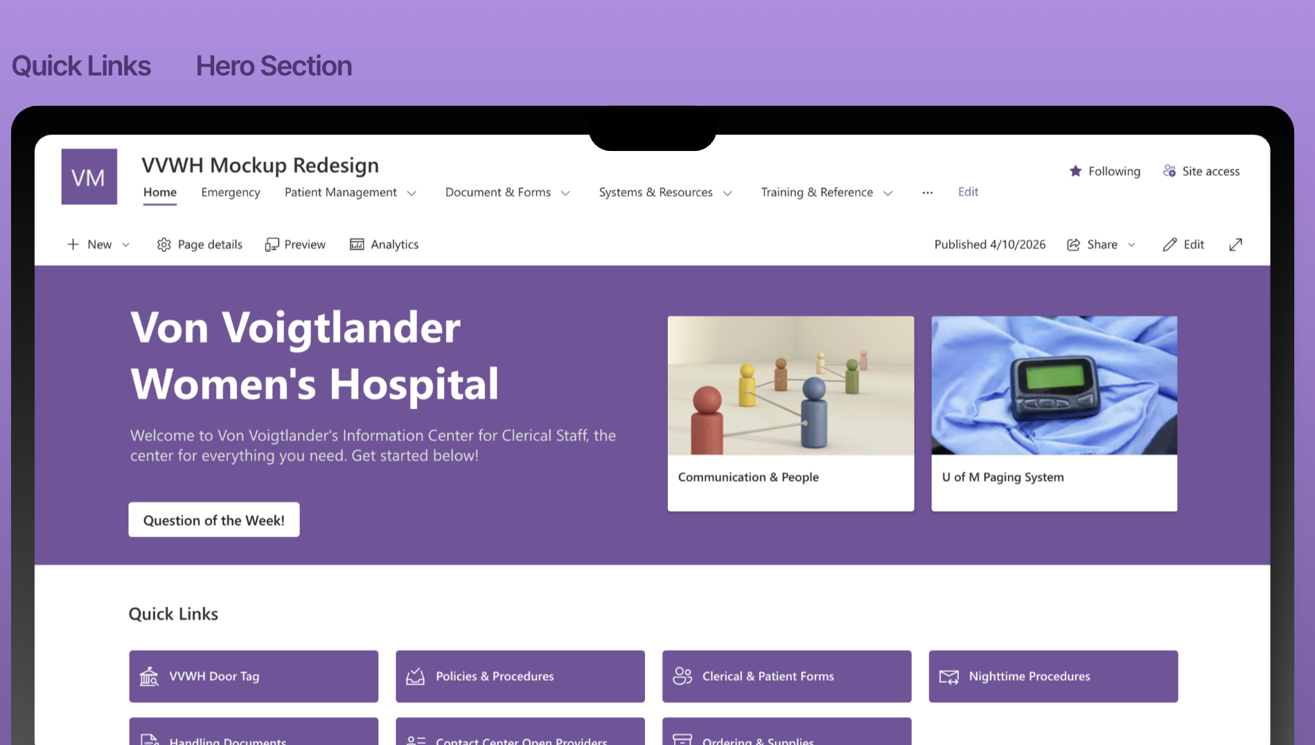
Von Voigtlander Women's Hospital's clerical staff depend on a SharePoint intranet to manage urgent situations, locate consent forms, and coordinate patient care. The existing site forced multi step navigation, surfaced outdated links, and lacked any personalization. I redesigned it from the ground up around real task based workflow.. directly in SharePoint!
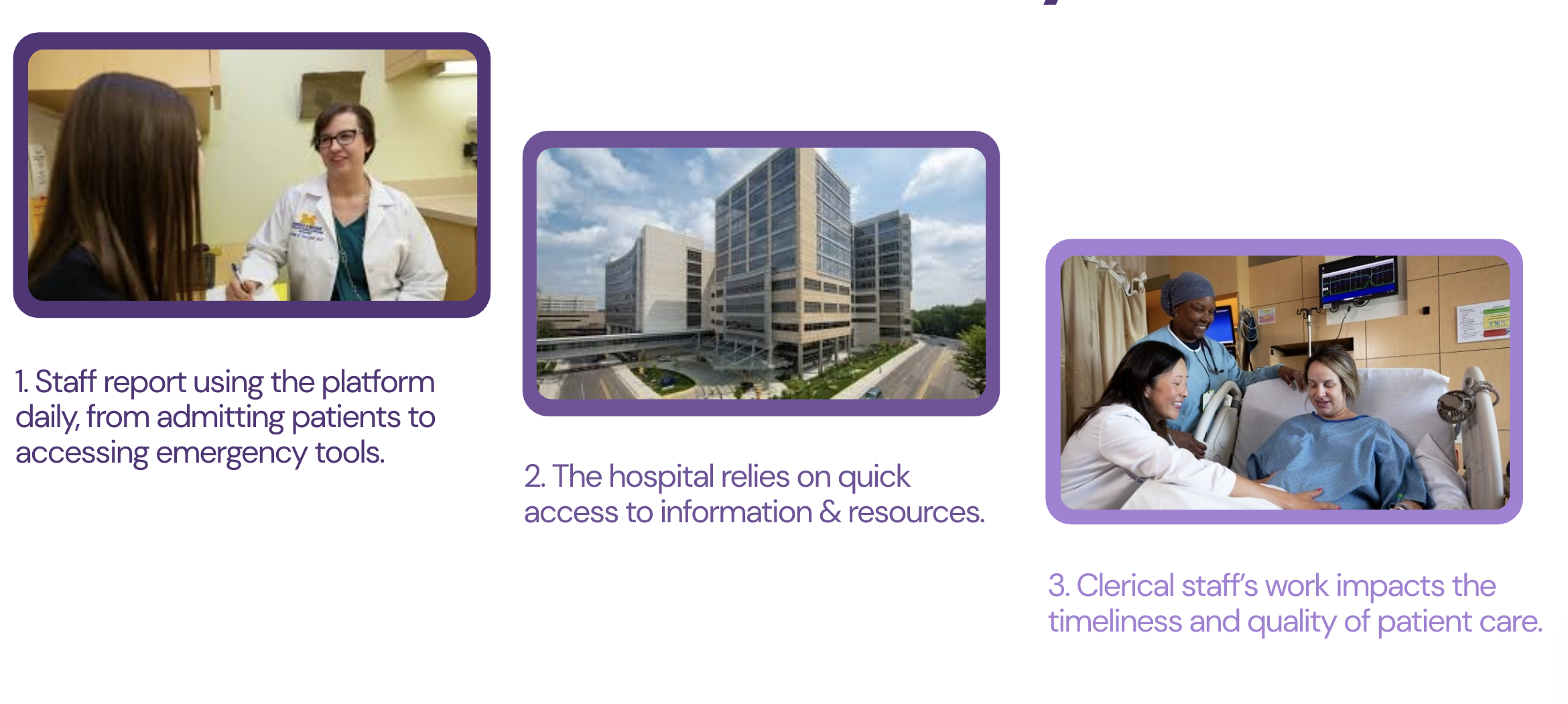
So Why Does This Matter?
Project Goals

Reduce Cognitive Overload
Improve Navigation Clarity
Surface High Priority Content
Client
University of Michigan Von Voigtlander Women’s Hospital, a nationally ranked maternity and women’s health center.
The hospital currently serves over 133,000 women a year and is committed to delivering exceptional patient care.
Research
Research was guided by three core questions designed to align with project objectives:
What situations prompt users to use the SharePoint site during their daily work?
How does the current SharePoint system support or disrupt task flows?
What are the three main issues that create confusion, stress, or inefficiency in workflows?
By using a mixed methods approach, I was able to understand how clerical staff actually use the site, where friction is, and what improvements would have the highest impact on patient care quality.
Survey
14 responses out of 36~ clerical staff
Mapped common tasks, pain points, and goals across the team.
Research Insights
Five consistent problems made SharePoint hard to use.
I synthesized from affinity diagramming and a user journey map, tracking a single task across 6 steps.
Requirements
Contextual Interviews
5 in person sessions, ~30 min each
Staff demonstrated live task walkthroughs while thinking aloud
Clean, safety-focused interface that builds trust while enabling convenient food sharing.
Heuristic Evaluation
Applied Nielsen Norman's 10 heuristics to a representative task across all site pages.
System vs User Needs
"It's very informational and it's just hard to find in a fast manner." Content existed. Access didn't.
Future Development
Card Sorting
1 session, 25~ min
Revealed how staff mentally organize content (by task not document type)
Expanding reach and improving user experience.
Map integration for visual location discovery
Enhanced safety features including background verification options
Expanded dietary filtering and allergen management tools
Navigation & Findability
Multi level navigation menus with no recents to backtrack to. Even experienced staff got lost. "I couldn't find it for anything."
Inconsistent Information Architecture
Staff think in task flows (Admitting, Birth Documentation). However, the site was organized by document type, forcing clerical staff to guess where everything was.
Steep Learning Curve
There were no VVWH specific training resources. New hires navigated by trial and error.
Lack of User Control
There were no back buttons, broken links, dead ends. Most pages were outdated and staff reported not even using the home page widgets. Staff are also "stuck" which is critical during emergencies.
Average time to find downtime information during a busy shift was 4 minutes.